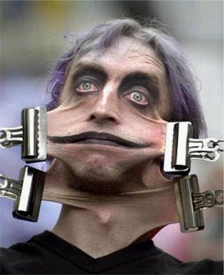
Bauer-Power is finished with its latest facelift!
Okay, okay, so the change wasn't that monumental. Not like the first change I did back in December. For that one I went from one of the horrible stock blogger templates to the one I just changed from today. With that one, I had to make all kinds of changes because the layout was a lot different. For this change, I just merged two different templates from the same designer to make my own slightly unique version. The big difference is that the post area now has the white background. I did this mainly for continuity with my RSS feed. Since the background was dark before, I found that I had to change my fonts to lighter colors so site visitors could see it okay without getting their nuts twisted too much, but then that left the RSS subscribers behind, because the white background of the RSS feed on some readers didn't agree with the font colors I would choose.
I figured, the best thing to do was to use the white background, because the formatting is universal.
So what do you think of the new digs? Please take a moment to vote in my poll, or you can go ahead and leave a comment, take your pick!
Jul 6, 2008
Layout change complete! How do you like me now?
 9:06 PM
 Paul B


 Posted in:

